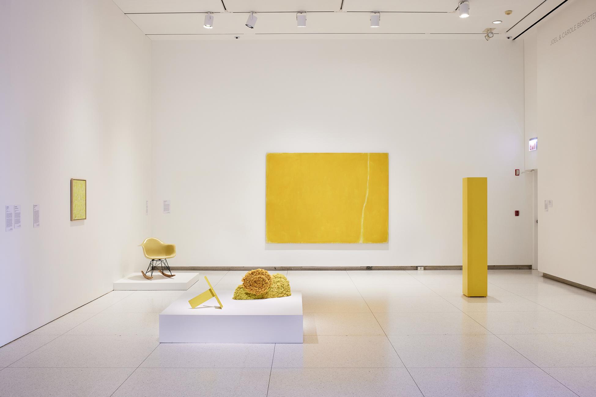
And it was all yellow: This Monochrome Multitudes gallery features works by Charles and Ray Eames, Anne Truitt, and William Turnbull. (Photography by Tyler Mallory)
A Smart Museum exhibition probes the past and future of monochrome art.
Visitors to the Smart Museum of Art’s fall exhibition Monochrome Multitudes are greeted by a floor-to-ceiling sweep of intense blue that covers the entirety of the museum’s soaring lobby wall. The hue is a nod to French artist Yves Klein. In 1960 he patented the color, International Klein Blue, and used it to create some of the era’s most iconic monochrome paintings.
Affixed to the wall is a giant modular structure made of white venetian blinds and steel rope, a new commission by artist Haegue Yang. The pairing is a fitting gateway to a show that revisits and expands our sense of “the monochrome”—art all in one color.
Precisely when and where monochrome art began is open to debate, but Kazimir Malevich’s Black Square (1915) and Alexander Rodchenko’s triptych Pure Red Color, Pure Blue Color, and Pure Yellow Color (1921) are important early examples. From there, artists associated with movements including abstract expressionism, minimalism, and color-field painting carried the practice forward.
Cocurator Christine Mehring, the Mary L. Block Professor in the Department of Art History, doesn’t pretend monochrome art is easy to digest—it’s a “totally reductive, seemingly elitist kind of art—one where everybody says, ‘I can do that too’ or ‘Why is this art?’” she notes. But she and Monochrome Multitudes collaborator Orianna Cacchione, the Smart’s curator of global contemporary art, “wanted to own the challenge.”
That challenge began many months ago when—thinking ahead to the Smart’s 50th anniversary in 2024—the two embarked on an exploration of the museum’s collection. There they found a “multitude of monochromes,” Cacchione says, though none that would be conventionally defined as such by a 20th-century art historian. “That provided the foundation for how we started expanding the concept—or critically complicating the concept.”
The 127 artworks on display (some on loan from alumni and Chicago-area collectors) are organized into galleries by color—blue, gray, yellow, white, black, and red—and by themes like “sound” and “the body.” And though monochromes “are almost always thought of through painting,” Cacchione says, here viewers encounter works that incorporate nontraditional materials—plumbing pipes, pantyhose, wood, cement. Sometimes these works are juxtaposed with more “traditional” monochromes; other times, they reference them. At every turn, a dialogue takes place.
For instance, Chicago artist Claire Zeisler’s Triptych (1967) features three plush, vibrantly colored wool rug panels, each interrupted by flowing sculptural tassels that, as an accompanying wall label describes them, “spill onto the floor like paint.” A kind of next-generation Rodchenko, Triptych pushes the boundaries of the abstract avant-garde through the introduction of fiber art.
Each piece is accompanied by interpretive text written by faculty members, conservators, and students, who approach the works through the lens of their varied disciplines. The exhibition has also created rich opportunities for student researchers. For a thematic room celebrating bunt (German for “multicolored”), Rachel Duffy, AM’22, spent nine months tracing the origins of a mobile from the Smart collection thought to be the work of Alexander Calder.
In the “white” room, professor of law Farah Peterson’s prose unpacks A Pattern or Practice (2015) by artist Bethany Collins. An assemblage of 91 white pages that hang in eight neat rows against a gallery wall, its surface is bumpy with blind-embossed language from a US Department of Justice report investigating the 2014 police killing of Black teenager Michael Brown in Ferguson, Missouri. The conclusion: officers engaged in systemic discrimination under the law, a “pattern or practice” warranting criminal charges. The monochromatic textural pattern is suggestive of “white systemic dominance,” Peterson writes; its tactility conveys how “texts dealing with race can have a physical impact on the body.”
In another room dedicated to the theme “walls,” Chicago sculptor Dan Peterman, MFA’86, has created a movable plinth from wood and drywall—itself a stack of monochromes. Peterman conceived of the piece to underscore his concern for reducing waste in contemporary building projects; he intends for its drywall to be reused in South Side housing construction. Paired with text from UChicago president Paul Alivisatos, AB’81, the piece sounds an alarm about climate change. Alivisatos, a chemist, zeroes in on the harm caused by one of drywall’s key chemicals: sulfur. “Fossil fuels often contain sulfur species that, when burned, become gaseous oxides of sulfur,” he writes. “If released into the atmosphere, these oxides of sulfur have deleterious effects, from producing acid rain to contributing to the ozone hole.”
Peterman’s work is drawing attention to change inside and outside museums. The Smart Museum has launched a pilot project to build freestanding movable walls that can be reused for multiple shows. “Every time you build an exhibition, you build walls and you tear them down and they go to waste,” Mehring says. “We really felt we had to go to a more sustainable model.”
The exhibition is not all seriousness. One not-to-be-missed gem on view is the Album primo-avrilesque (April Fool’s Album) published in 1897 by French satirist Alphonse Allais. (The University Library purchased a copy expressly for the exhibition—one of only three held in libraries worldwide.) The pamphlet features the first-known use of the term “monochrome” applied to art and single blocks of color in ornate frames, each with a flippant title that pokes fun at modern art. An all-red piece is titled “Tomato harvest by apoplectic cardinals at the edge of the Red Sea (Effect of aurora borealis).”
To Mehring, the album suggests a sort of prehistory of the monochrome. “[Allais is] making fun of monochrome art before monochrome art existed,” she says. Monochrome Multitudes traces just how far that style has come since—and how it keeps on evolving.
Updated 11.18.22 to include Ray Eames in the image caption.
