

“The story of color is almost the story of civilization itself,” Birren wrote in 1963. (Illustration by Cheryl Chalmers)
Twenty-nine years after his death, the work of Faber Birren, EX’23, still colors the world around us.
“I am convinced when I say that color has been a neglected art,” Faber Birren, EX’23, declared in 1934.
No one could make the same claim today, eight decades on. Certain slivers of ROYGBIV—like Tiffany blue or T-Mobile magenta—have been copyrighted under federal law, while others have inspired scientific inquiry and even public policy interventions. Take Baker-Miller pink, a shade some believe has a soothing effect (the experimental evidence for this claim is mixed). Endorsers include supermodel Kendall Jenner, who painted her living room in the bubblegum-like hue, and prison officials in Switzerland, where every fifth prison or police station has at least one pink cell.
How color came to a place of such cultural and commercial prominence is a big question, but it has some answers in the life and writings of Birren, an unconventional consultant and theorist who proclaimed that he was concerned with color “not as individual feeling and expression but as mass psychology and mass reaction.” Over a nearly 60-year career, Birren went from a self-taught enthusiast to “the most authoritative source” on color according to the New York Times.
Birren didn’t just demystify his subject: he “put color to work,” as he described it, in 20th-century America, from the machinery of heavy industry to the linoleum of suburban kitchens. Alongside these commercial efforts, he wrote probing reflections on more speculative, less understood aspects of color—its power to heal us and to change how we feel.
After emigrating from Luxembourg, Birren’s grandfather Henry Birren settled in Chicago in 1848 and became an undertaker. Faber wrote in a 1928 family history that it was “out of pure love for beauty, in spite of his heritage of frugality” that he drove “the finest hearse that graced the city’s streets.”
Joseph Birren—Henry’s youngest son, and the only one not to become an undertaker—started as a professional painter in 1885, when he was recruited to work on a 360-degree picture, or cyclorama, of the Battle of Gettysburg. (“He was the only painter on the staff who could achieve the task of making a dead soldier look dead,” Faber wrote.) Joseph traveled the world, drew illustrations for newspapers, and earned acclaim for a 1924 solo exhibition at the Art Institute of Chicago.
That Faber is an anagram of the German Farbe, for color, seems to be a coincidence—Faber shared his given name with his grandmother Catherine’s maiden name. Still, it fit. As a child, he drew on walls and painted murals; as a teen, he experimented with dyes.
After a brief stint at the Art Institute, Birren arrived at the University of Chicago in the fall of 1919 with plans to study education. He discovered he didn’t miss making art but couldn’t shake his interest in studying color—and such a program didn’t exist at the University of Chicago, or any other academic institution. In the spring of 1921, Birren dropped out, committed to educate himself about color, and became a regular at the Chicago Public Library.
Birren’s early studies were, in a word, eccentric. At one point he resolved to test an old scrap of folklore—that being surrounded by red walls could make a person go mad—by coating his entire bedroom with vermillion paint. In a week’s time, the only change he could gather was that he felt cozy and cheerful.
In 1935 Birren left Chicago for New York City, where he began to evangelize about color design to skeptical industrialists. He promised a Chicago wholesale meat company he could boost their sales—the white walls of the company’s coolers, he believed, lent the meat an unappealing gray tinge. Birren studied porterhouse steaks under various lights before determining a blue-green backdrop would make the beef look redder. Sales went up, and before long the company’s top competitor changed its color scheme too.
It wasn’t until color was found to have an impact on bottom lines that Birren gained a real audience with corporate America. In 1945’s Selling with Color (McGraw-Hill), Birren related stories from his own clients (painting office walls a darker tone than machinery reduced irritability and inattentiveness among workers, he found); best practices (in hospitals, operating rooms should be blue-green, while private patient rooms should be decorated in warm, light tones); and, for good measure, a smattering of interesting stories he’d heard (Purdue University, he learned, developed red nail polish for agricultural laborers to compare against the ripeness of tomatoes).
Soon Birren’s services were in demand in a wide range of industries. When a pool table manufacturer asked him to boost sales, he suggested that they do away with seedy pool shark connotations by changing the baize from green to purple. Sales picked up. Then, in 1939, Walt Disney invited Birren to work as a color consultant. He ended up advising Disney animators on the design of Bambi, Fantasia, and Pinocchio.
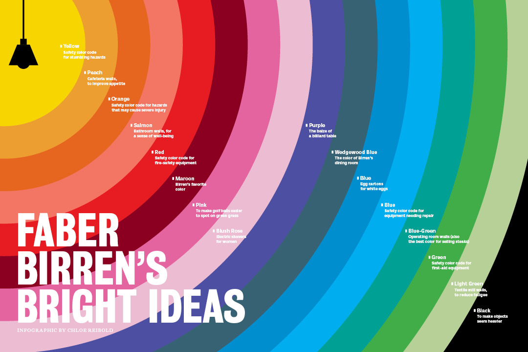
His business prospects weathered World War II. At a time when other artists were recruited to disguise US troops and tanks, Birren brought bright colors to wartime industry. As inexperienced workers replaced deployed soldiers in dangerous factories, he worked with the DuPont Company to codify the use of bright colors to mark workplace hazards—yellow for stumbling hazards; red for fire protection; orange for equipment that might “cut, crush, burn, or shock”; blue for caution; green for first aid. The system was also adopted by the US Army. For Birren this was truly color at work: intended not merely to decorate, but to catch the eye “with serious meaning.”
In 1947 American Magazine compared the lanky, analytical Birren to Sherlock Holmes, and in the postwar era he continued to fit the part. In 1954 Condé Nast hired him as a consultant to House and Garden, where he used computers to analyze paint sales and forecast seasonal trends.
In the factory or the supermarket, Birren was a businessman. On the page, in books such as Color and Human Response: Aspects of Light and Color Bearing on the Reactions of Living Things and the Welfare of Human Beings (Van Nostrand Reinhold, 1978), he styled himself as a student of color in the tradition of poet Johann Wolfgang von Goethe, who wrote a book (Farbenlehre, 1810) on color theory, and French chemist Michel-Eugène Chevreul, an early theorist of color interaction.
Birren, who died in 1988, steered clear of what he dubbed “hyperbole and outright charlatanry” on the subject of color; in writing about its therapeutic uses, he cited the scientific research of his day. For instance, he devotes several pages in Color Psychology and Color Therapy: A Factual Study of the Influence of Color on Human Life (McGraw-Hill, 1950) to the psychoanalyst Felix Deutsch, who observed alterations in his patients’ blood pressures when he put them in different colored rooms. Describing how artists and designers should use color, Birren used language borrowed from medicine: they “may now … write prescriptions which have a basis in fact rather than fancy.”
Still, his approach to his life’s work was never just scientific. “Color … is more like religion,” Birren wrote in 1945. “It is in the blood, an essential part of the psychic make-up of an individual.” For all Birren’s insistence on the need for the clinical study and use of color, his writings couldn’t help but betray a sense of awe at its power.