
Why there’s nothing neutral about gray.
If I were to ask for your favorite color, you might say blue, green, or yellow. If you’re a person who marches to the beat of a slightly different drum, you may go for orange or purple. But unless you’re a true radical, I doubt you would say gray.
On a gut-reaction level, gray gets a bad rap. It’s gloomy and dull. The color of concrete and elephant hide. A melancholy reminder of Soviet-era architecture or dreary winter days. It’s such an ambivalent word that the English-speaking world can’t even agree on how to spell it.
Gray doesn’t seem to have much going for it, but somehow it has crept into our lives with impressive stealth, pollinating our homes, closets, and offices at an alarming rate. In 2020 the UK-based Science Museum Group analyzed more than 7,000 photographs of everyday objects from its holdings. This motley collection, consisting of everything from cameras and clocks to telephones and board games, revealed a surprising trend: since 1800 the variety of colors in everyday objects has sharply declined, and gray has come to reign supreme. The plummet has been steepest between the years 2000 and 2020. Where warm golds, reds, and browns used to sing, now gunmetal gray, charcoal, and silver announce their “sleek” glory.
Industries such as interior design and automotive sales have witnessed similar shifts. According to the Drive magazine, more than 70 percent of cars today are produced in white, silver, gray, or black, whereas in 1996, that number hovered around 40 percent.
As a historian who studies color in Europe and the United States, I wanted to explore this surging neutrality and understand what’s fueling the gray wave. Why has vibrant color seen such a striking decline in recent decades, and why has Technicolor’s promise faded into a notably dull palette?
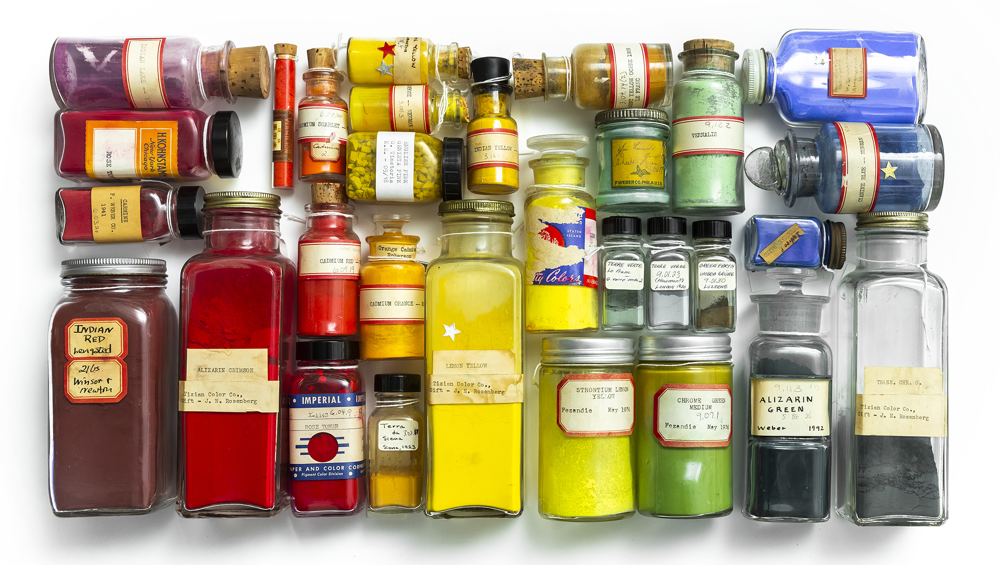
For starters, that promise itself might be partially to blame. Nineteenth-century industrialization created a magical fairyland of color. For millennia, pigments and colorants came from natural sources: insects, minerals, and plants. They were bound to the times and tides of geography, and access to the brightest colors was often limited to those with fat pocketbooks or aristocratic blood. But the 19th century brought the rise of new technologies, including the petrochemical industry and its progeny: synthetic colors. For a few pennies, even the most down-and-out could afford trinkets dyed with vibrant arsenic-based and coal-tar-based colors. Magenta ribbons, violet stockings, electric-blue paper flowers with wickedly green stems—colorful items flooded the world with wonder and delight.
Over time, though, that wonder faded to a casual familiarity. Mass production had a devaluing effect on color, and in 1956, the writer Aldous Huxley succinctly explained the widespread apathy for vibrant palettes: “We have seen too much pure, bright color at Woolworth’s to find it intrinsically transporting.” Today’s gravitational pull toward gray, beige, ivory, and white signals disillusionment with the modern, hypersaturated world.
At the dawn of the 20th century, hypersaturation went hand in hand with hyperstimulation, and social theorists such as Georg Simmel and Walter Benjamin described modernity as a constant barrage of sensory shocks. Cities surged with traffic, chemical dyes drenched textiles and walls, and lurid advertisements cried for attention at every turn. The 19th-century writer Pierre de Lano warned, “Color … is a modern taste, born certainly of the nervousness that torments our imagination.” Some of his contemporaries likewise described modern palettes as “anarchic,” “piercing,” “insane,” “vulgar,” and “bewildering.”
Nevertheless, the so-called modern taste continued apace, and over the following century, we added electronic colors to the visual roster. Screens blast radiant wavelengths throughout the day, entrancing and exhausting us by turns. Our schedules and brains are such hotbeds of disorder, people long for an environment that reads as a blank slate. In large part, the hunger for white walls and sleek, minimal interiors has emerged as a response to overstimulation.
Neutral colors offer a possible antidote to mass exhaustion. Humans may not be able to control the wildness of the world, but we can exercise restraint on our surroundings. An uncluttered space can lead to an uncluttered mind, the thinking goes, and there seems to be a collective assumption that gray offers the eye a chance to rest. In the minimal interiors of today, neutral colors have become a kind of shorthand for absence: this room is clear of disorder, uncertainty, stress, and the messiness of life.
Yet it’s worth asking why other colors have become synonymous with clutter. What do gray walls offer that sunshine yellow or royal blue cannot? Likewise, why do we so readily view colors like oatmeal or ash as “neutral” in the first place? As the art theorist David Batchelor wrote in 2000, the aversion to color runs deep: “In the West … color has been systematically marginalized, reviled, diminished, and degraded.”
Over time this marginalization of color has led to collective chromophobia, or fear of color. In such a worldview, a pop of color is acceptable, but bright swaths seem “loud,” “garish,” or “tacky.” Chromophobia appears in full force when it comes to home resale values. A 2018 Zillow report reveals that homes with a charcoal-colored door sell for $6,721 more than expected, and houses with a greige (light gray/beige) exterior can boost a home’s value by $3,500.
Scholars like Batchelor and anthropologist Michael Taussig have compellingly argued that chromophobia can be linked to deep-seated economic and racial fears. After the initial excitement of the chromatic turn, many elite Europeans associated the new, vibrant colors with otherness, degeneracy, and intellectual inferiority. By the end of the 19th century, the middle and upper classes often treated abundant bright colors as a mark of disgrace, suitable only for unsophisticated people who couldn’t appreciate subtler shades.
The satirical British publication Punch drove the point home in an 1877 cartoon where a hostess wishes to introduce a stylishly lispy gentleman to an eligible young lady. The gentleman declines, because “I weally couldn’t go down to suppah with a young lady who wears mauve twimmings in her skirt, and magenta wibbons in her hair!” As outlandish as Punch made such prejudices seem, they were prevalent enough to provoke cultural comment, and these stereotypes had remarkable staying power. Increasingly, good taste became linked to “quiet colors.” For example, gentlemen adopted dark suits, and demure women never wore red.
Over time neutrals became an indicator of social and moral superiority, and vestiges of these ideas still exist today. Google “expensive interiors,” “luxury interior design,” “high-end aesthetic,” “chic clothing,” or “classy fashion,” and you’ll be greeted by a desaturated palette. If you want to witness an exercise in true restraint, check out Kim Kardashian’s $60 million mansion, swathed in ivory, white, and natural wood. The new opulence is decidedly abstemious.
Given that color preferences lie at a complex juncture between personal preference, cultural symbolism, collective psychology, historical developments, and economic imperatives, it’s unsurprising that many people have an ambivalent relationship with color. Nevertheless, shouldn’t we be at least somewhat enthusiastic about the colors in our lives? Our homes, workplaces, and hangouts are more than just backdrops—they’re the environments in which we grow, love, thrive, fail, and challenge ourselves. Rather than minimizing the influence of colors on our lives, we should start thinking about how they can amplify our feelings or bring ornamentation to the dull daily routines that, arguably, already add enough grayness to life.
Carolyn Purnell, AM’07, PhD’13, is the author of Blue Jeans (Bloomsbury, 2023) and The Sensational Past: How the Enlightenment Changed the Way We Use Our Senses (W. W. Norton, 2017).