
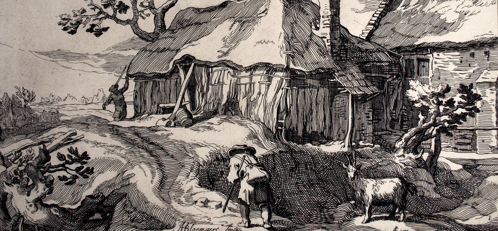
Prints and Privacy showcases images meant to be lingered over in solitude or shared among friends. (Boetius Adams Bolswert, After Abraham Bloemaert, Landscape, c. 1614, Etching on laid paper. Smart Museum of Art, The University of Chicago, Bequest of Ruth Philbrick, 2010.37)
The Smart Museum’s latest exhibit explores the private prints of pre-1900 Europe.
There’s an odd detail floating in the middle of Landscape, an early 17th-century engraving by Dutch printmaker Boetius Adams Bolswert. The print depicts a pastoral scene in a newly independent Netherlands; above a pair of farmers toiling beside a thatched-roof farmhouse, a vague figure hovers in the sky. Is it a flying cherub? A baby riding a bird, perhaps a swan? Is it just a cloud? “I couldn’t figure it out. It’s a curious little gem,” says Maya Landau, Class of 2017, one of the student curators for the Smart Museum’s exhibit Prints and Privacy.
Since the rise of woodcuts, prints have been a form of mass media—easily manufactured and distributed on a large scale, they tended to exist within the public sphere. But the 14 pieces in Prints and Privacy showcase different private forms of print consumption. For a variety of reasons, printmakers would create and sell small batches of prints for wealthy buyers. Tucked away in the drawers and cabinets of pre-1900 Europe, the more erotic or political prints became objects to linger over in solitude or to pass around among friends. Others were more visible items of conspicuous consumption, publicly tying their owner to a particular artist or movement. The aim of Prints and Privacy is to put both kinds of works on display and to explore the uncertainties that attach to a print when it emerges, or reemerges, for public scrutiny.
The privacy is what allowed Landscape’s “curious little gem” to remain a mystery over the years and into the present day. “There were in-jokes. There were visual references that might have had a meaning to people at the time,” says Anne Leonard, a Smart curator who taught the art history class that produced Prints and Privacy. “Because [the prints] were more private, they weren’t commented on in the critical discourse of the period. ... An image like this tends to stay more opaque.”
The display room for the exhibit is dimly lit, purposely reminiscent of a private study. On the north wall, three prints are obscured by frosted glass, and a curtain hangs over another. Their taboo subject matter—an image of young French women shrouded in smoke from an opium lamp, a stark portrait of a dead woman—meant they were likely to have been kept hidden and viewed only by the owner. “You could cultivate your public image with embracing x or y artistic movement, but you could also have these darker prints that you wouldn’t share with your friends. They were things for your personal consumption,” says Landau.
Along the opposite wall from the display cases is a row of portraits, including one of playwright Henrik Ibsen. Underneath his signature, the artist Félix Vallotton numbered the Ibsen print with a scrawled “77.” Because the plates and blocks used in the printing process gradually deteriorated, small differences could be found between various versions of the same print; within the elite market of private collection, the small changes took on an outsize importance. “These were very fey kinds of sophisticated aesthetes—though I don’t mean to caricature,” says Leonard. “There’s kind of an obsession, a fetishizing of minute qualities of distinction between different kinds of prints, and the paper, and the kinds of ink color, and so on.”
[[{"type":"media","view_mode":"media_original","fid":"3655","attributes":{"alt":"","class":"media-image","height":"481","typeof":"foaf:Image","width":"500"}}]] Félix Vallotton, To Ibsen (À Ibsen), ed. 77/120, 1894, Woodcut. Smart Museum of Art, The University of Chicago, Purchase, Paul and Miriam Kirkley Fund for Acquisitions, 2005.57.
Artists took advantage of collectors’ mania. According to Leonard, the late 19th-century American painter James McNeill Whistler would create and sell different versions of his prints as “proof states”—normally, these were rare practice sketches of a print or painting, but in Whistler’s case they were simply extras produced for profit. He also created a distinctive logo that looked like a butterfly, a unique signature to make his work more valuable. Apart from this manipulation, Whistler poked fun at the obsession of print buyers. PhD student Hilary Barker, another of the exhibit’s student curators, explains that for Long Venice, one of his prints on display, Whistler refused to trim the margins, making it more difficult for collectors to fit it into their portfolios. “He’s making fun of the different ways that collectors valued prints other than just the qualities of the image,” says Barker. “They were things that don’t really change what you’re looking at.”