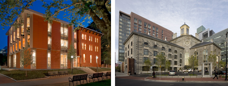
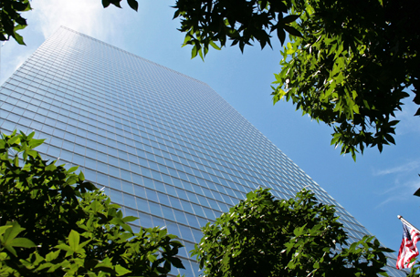
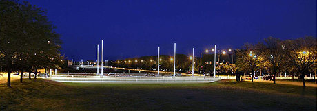
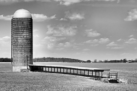
Above: A preliminary rendering for 5757 S. University. (Courtesy University of Chicago Facilities Services) Below: University of Pennsylvania Music Building and Boston’s Liberty Hotel (Courtesy Ann Beha Architects); 7 World Trade Center (Photography by Erika Koop, courtesy Silverstein Properties); Carpenter’s Midway Crossings and rendering for William Eckhardt Research Center (Courtesy University of Chicago Facilities Services); Grain silo and Reva and David Logan Center for the Arts (Courtesy Tod Williams and Billie Tsien).
Architects of new campus additions share the theories underlying their practice.
As four out-of-town designers spoke about creating new buildings and public spaces for the University of Chicago, one thing was clear: they’d made no little plans.
At a May 24 panel discussion organized by the Art Institute of Chicago, Ann Beha, James Carpenter, Billie Tsien, and Tod Williams revealed how their ambitious UChicago projects built on previous work.
Balancing act
“The building that I’m working on with my team is a liturgical building, and it’s going to become the Department of Economics—so there’s a certain leap of faith associated with that,” said Ann Beha. Since her Boston firm was tapped to turn the former Chicago Theological Seminary (and home to the Seminary Co-op Bookstore) into a temple for Chicago-style economics, she admitted, “every joke that can be made has been made.”
In the 1970s, as an architecture student at MIT, Beha wrote her thesis on the adaptive reuse of an urban church. Ever since, when tackling updates of significant historic and public buildings, she has sought a “balance between stewardship and intervention.”
Renovating structures like the Music Building at the University of Pennsylvania (above left), Beha considered how an original building—in this case, an 1890 orphanage—could “either connect, contrast, or be in dialogue with something new.” The same principle applied when her firm turned Boston’s historic Charles Street Jail into the luxurious Liberty Hotel (above right).
Beha said the improbable success of such projects confirmed her belief that “we only need to look to the world around us—and existing buildings—to know what our cities might become.”
In Chicago, she and her colleagues have joked that there’s “no pressure” to strike the right note in renovating 5757 S. University, an imposing Herbert Riddle building just steps from the main quadrangles, Frank Lloyd Wright’s Robie House, Rockefeller Chapel, and Rafael Viñoly’s Charles M. Harper Center.
Preliminary plans hint at Beha’s determination to keep up with the neighbors. In the proposed renovation, old liturgical spaces will become soaring high-tech classrooms; an unused attic will be converted into graduate student lofts. A new three-story glass-and-steel research building will rise in the space between the former seminary and three restored row houses on South Woodlawn.
The nearby alley and surrounding yards—and possibly some of 58th Street—will be transformed into expansive green space or mews. “Overall, the idea is to extend the campus fabric through pedestrian, landscape, and lighting initiatives,” said Beha, “and to fold in a space that was distant and remote to the heart of campus, the community, and the university.”
Light the way
As a sculpture and architecture student at the Rhode Island School of Design, James Carpenter became fascinated with light and how manifestations of light in nature can be transposed to the built environment.
“The idea of light is completely specific to its location,” argues Carpenter, a former Macarthur fellow and consultant to Corning Glass Works. His firm designed the exterior podium wall and lighting for 7 World Trade Center in New York City (above), fashioned from stainless steel prisms that simultaneously ventilate the building and reflect and reproject sunlight.
Carpenter’s Midway Crossings—the pedestrian walkways that connect the north and south campus—was inspired by Frederick Law Olmsted’s vision of the Midway Plaisance as a long canal. “The idea came to mind that we should really treat these crossings as bridges,” Carpenter said, giving pedestrians a sense that they are crossing water and seeing light reflect off water.
The project’s 40-foot “light sabers” (above) are meant to engage people who pass across the Midway at night by casting light horizontally rather than letting it pool on the ground. “There is a movement afoot of using light as a way of linking other parts of the campus together in the future,” Carpenter added.
Carpenter is working with the architectural firm HOK to create the exterior envelope for the William Eckhardt Research Center, a sparkling glass laboratory building under construction at 57th and Ellis (above). “The idea here is to have remarkable qualities of light come into the work, office, and public spaces,” he said. “Light, again, is the organizational principle for the building.”
A magic castle for the arts
A silo standing alone in a flat, Midwestern plain evoked Tod Williams and Billie Tsien’s original design for the Reva and David Logan Center for the Arts. Yet the pair’s “tower of the arts” (below) is meant to counteract the silo effect that can isolate creative artists and academics from each other.
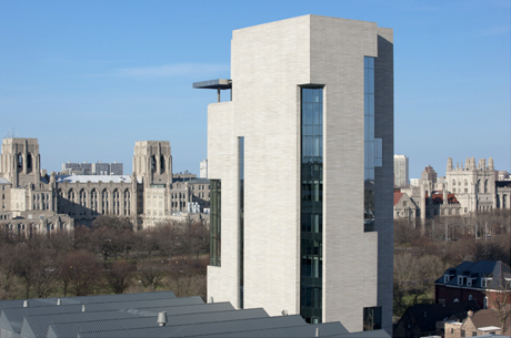
“In the vertical building what we’re trying to do is mix the program up,” said Tsien. Music practice rooms thus share lobbies with visual-arts classrooms; stairwells and studios have windows that let passersby see into work and performance spaces. The building boasts glorious views of the Midway and surrounding neighborhoods, and people can open giant windows and sliding doors to let fresh air in.
Williams and Tsien highlighted two of their previous projects that share the Logan Center’s design DNA: Skirkanich Hall at the University of Pennsylvania and the David Rubinstein Atrium at Lincoln Center.
“One of the things that we feel about our architecture is that we don’t want the buildings to be objects in a landscape,” explained Tsien. “We really want them to make spaces.” Between the Logan Center and neighboring Midway Studios, for example, a central courtyard can be a place to eat lunch, show art, or rehearse scenes from a play.
The benches and alcoves scattered irregularly among the tower’s stairwells create what Tsien called a “magic castle” of unexpected places for students to discover and colonize. (She was delighted to hear about a quote from a Harry Potter novel that appeared on a blackboard when the building first opened: “Watch out for the stairs—they’re always changing!”)
Tsien and Williams are known for their “tactile” design, and the Logan Center includes plush felt walls that cry out to be touched (and to have fliers posted on them). The architects chose other materials—variegated limestone, tile dipped in grey pigment—that both acknowledge and move away from the Collegiate Gothic style of early campus buildings.
Answering questions after their presentations, the four designers reflected on what they’ve learned from their first-ever projects in Chicago. Beha said she appreciated the University’s willingness to be a “guardian angel” for historic buildings, “but their bravery, as well, about contemporary work within the historic context.”
Williams added that traditional campus architecture taught him not to be afraid “of weight and toughness, beauty and delight.”
Carpenter plans to return in the fall for a collaborative fellowship in the physics department. “The streets of Chicago, the scale and openness of the city grid, have this remarkable generosity,” he said. “These buildings do sit in a very sublime way on this open field. That’s something I’ll surely take away from working here.”

