
Above: A selection from a sketchbook Tobin kept during a summer 2001 trip to Japan. Below: Some of Tobin’s book cover designs. (Sketchbook image courtesy Isaac Tobin. All book covers courtesy University of Chicago Press, unless noted otherwise)
Isaac Tobin’s designs for University of Chicago Press books provoke readers to take a deeper look.
(Some Day Your Witch Will Come cover courtesy Wayne State Press)
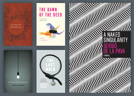
In the original Australian edition, paleontologist John A. Long’s book about the prehistoric origins of sex was called Hung Like an Argentine Duck. The University of Chicago Press chose a more demure title, The Dawn of the Deed, but its cover illustration went all the way.
Senior designer Isaac Tobin’s graphic depiction of Tyrannosaurus sex—familiar skeletons arranged in a way that suggests a fossil Kama Sutra within—exposed the book’s scientific content and wry tone in a single image. It was almost even more revealing.
As the deadline for the cover design loomed, Tobin’s wife, illustrator Lauren Nassef, suggested that he add a black censor bar to conceal the pertinent bones. There wasn’t actually anything to hide; the illusion that there might be just added to the temptation to peek under the cover. “It gave it a little more depth that then invites the reader to think, what’s behind that bar? In this case, that’s kind of a funny thought,” Tobin says. But, he adds, “that really is the question of the book—what’s going on behind that bar?”
The covers that Tobin designs for the press usually lack the sex appeal of The Dawn of the Deed, but he always has the same objective: to turn a voyeuristic impulse into deeper curiosity. But conveying dense academic detail in an arresting and attractive way can be a challenge.
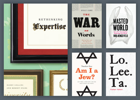
(Am I a Jew? cover courtesy Penguin Press; Lolita cover courtesy Venus Febriculosa/Print Books)
Since he joined the press in 2005, Tobin’s covers have met that challenge with noteworthy style, earning honors from the Art Directors Club and the Association of American University Presses, and recognition in annual anthologies. In 2010 New City named Tobin, also a prolific freelance designer, one of Chicago’s Lit 50, saying he “proves there’s hope yet for print media.”
Tobin strives for a design that is “unexpected … even sometimes a little bit challenging for the viewer, that kind of causes you to stop even just for a few seconds to reconsider.” That strategy often results in covers that are simple and approachable on the surface, with layers to sift through on closer inspection.
For The Subversive Copy Editor, Tobin created an actual rubber-banded, binder-clipped, ink-stamped manuscript, Post-it noted with the subtitle in author Carol Fisher Saller’s handwriting. On the cover of Wasted World, about the ecological damage of population growth and consumption, a plastic shopping bag wrinkles into a ghostly specter. An Ethics of Interrogation sets a noir mood with a light bulb dangling from a wire, illuminating darkness into something no brighter than gray. And a marble bust smudged with the eye black that modern athletes use to reduce the sun’s glare illustrates Contemporary Athletics and Ancient Greek Ideals.
One of his best known covers, Tobin says, was a tough sell. Lennard J. Davis’s Obsession traces the social and medical history of behavior that can be a clinical pathology, but also an admired trait in, for example, great athletes or artists. Because of that paradox, Tobin could not reduce the subject to an image that would allude to one connotation or the other. “So I had this idea that the cover should be a product of obsession,” he says, “rather than a depiction of it.”
Nassef suggested an obsessive process she had used before, making pinpricks through thick card stock. “What made it kind of hard to pitch this idea was that you couldn’t really see what it looked like until it was done,” Tobin says. He presented a one-inch sample for approval with an appeal to imagine the finished product.
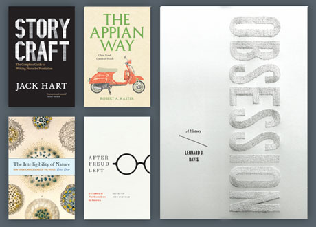
After getting the OK, “we just kind of went for it.” Prick by painstaking prick, Nassef spelled out the word OBSESSION, which runs vertically the length of the cover. A pin rests just to the left, a clue to the labor-intensive technique. “You can’t quite tell on that first glance what’s happening,” Tobin says, “but hopefully it’s intriguing enough that you take another look, and kind of lean in even, to see what’s happening.”
Tobin considers himself an obsessive designer, and he also focuses his intense attentions on a book’s interior. “It’s really important work and it both aesthetically creates an impression in the reader that this is a book that is professional and trustworthy and smart,” he says, “but also can really help, just in a very practical way, make the text readable and usable.”
Tablets and e-readers cede those decisions to the user, who can often choose a typeface and size. The flexibility is useful, Tobin acknowledges, but it fundamentally alters the experience that he works to create in print.
His approach to cover designs, on the other hand, hasn’t changed even as Kindles have sparked an ink and paper bonfire. Book covers always have had to work at reduced size, to be appealing from afar on a bookshelf or to make attractive catalog displays. “Things like color and shape,” Tobin says, “can do a lot to work from a distance or in a thumbnail.”
Tobin developed his aesthetic sensibility at the Rhode Island School of Design, graduating in 2002. Before that he went to Barack Obama’s Honolulu high school—his parents, educational anthropologist Joseph J. Tobin, PhD’83, and English and women’s studies scholar Beth Fowkes Tobin, AM’74, PhD’85, were University of Hawaii professors.
A couple of Tobin’s favorite teachers at the Rhode Island School of Design happened to be book designers. Their influence led him to pursue it as a career—although he wonders if the impulse took root long before that.
As a kid, Tobin visited Hyde Park with his parents in the summers. Their luggage would include an empty suitcase to fill up at the Seminary Co-op. More of an artist than an academic, he saw something different in the books than his parents did. But he has come to believe that they found shared inspiration on the store’s shelves.
“They were trying to write books that would end up in that bookstore, so what could I do?” Tobin says. “In my case, that’s making the covers for them.”